One of the most powerful features in Blocs is the ability to use custom classes within your projects. If you come from a graphic design background, think of custom classes as layer styles you can assign to any item in Blocs to give it a specific look and feel. The rules of these classes can be adjusted to appear different on desktop, tablet and mobile which means you have the ability to fine tune every detail of an item specifically for the device it’s being viewed on. This introduction video covers the basics of custom classes.
Applying a Custom Class
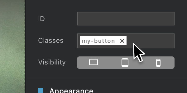
To apply a custom class to an item within Blocs, first select the item on the canvas by Left Clicking it. Now in the sidebar options locate the field labelled Classes and click inside this field to activate it.
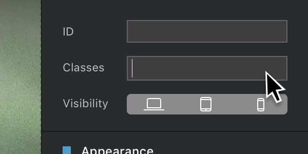
Once activated, using your keyboard type in the name you wish to give your class or the name of a class that already exists in your project and then hit return. This will create a custom class tag in the classes field, this means this class is now assigned to this item. You can repeat this process to add multiple classes to the same item.
Accessing The Values of a Custom Class
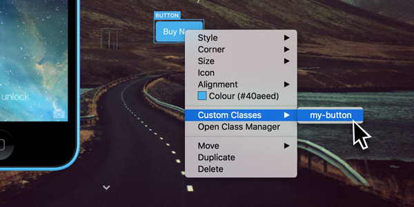
There are a number of ways to access the values of a custom class within Blocs. The easiest way is to right click an item which will show the context menu. From this menu, select Custom Classes and then Left Click the class you wish to view from the dropdown. This will open the selected class in the class editor so you can view and edit its values.
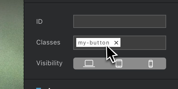
You can also access the values of a custom class by Left Clicking on one of the class tags that are found within the class field, located in the main sidebar options for the selected item.
Editing a Custom Class
Blocs comes with a powerful class editor built in that lets you easily edit classes visually.
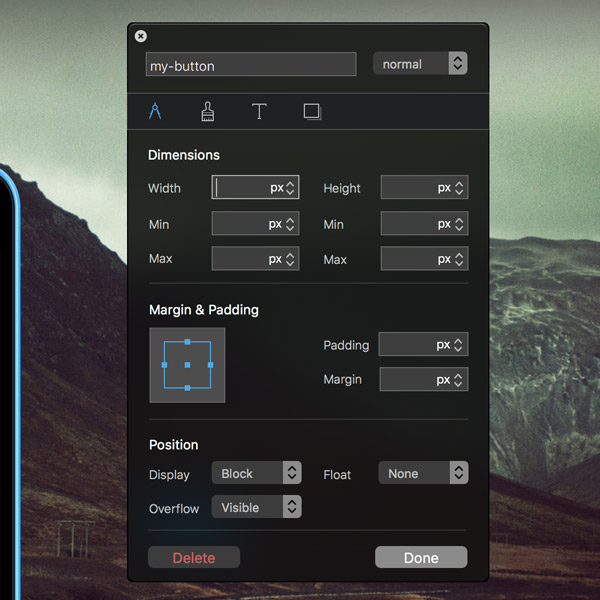
The class editor is broken up into 4 sections to make editing different rule types and values more manageable and clear.
1. Metrics – This set of options focuses on the measurement rules for a class, e.g. width, height.
2. Style – This set of options focuses on the visual style rules of a class, e.g. borders and backgrounds.
3. Typography – This set of options focuses on the typography rules for a class, e.g. font size, letter spacing.
4. Shadows – This set of options focuses on the shadow rules for a class, e.g. text shadow, box shadow.
Within each of the four sections, there are a number of labelled user interface elements that let you apply specific values for the standard CSS3 rules.
Editing a Class For a Specific Breakpoint
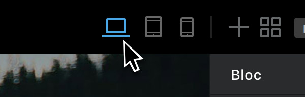
In Blocs it’s possible to adjust the values of any class based on the breakpoint it’s viewed at. This is extremely useful as it allows you to create a completely unique experience for your users depending on the device they are using when they visit your website. To edit the values of a class at a specific breakpoint, first switch into that breakpoint using the breakpoint view options located at the top right of the apps main toolbar and then by repeating the standard “Accessing The Values of a Custom Class” steps from above. We also recommend watching this video lesson on Responsive Classes.
You can find out more about how the breakpoint view controls work here.
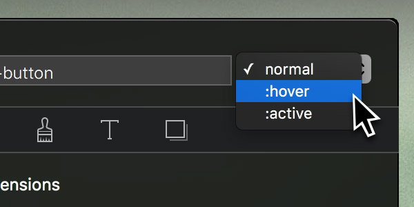
Class States
As well as being able to set the visual style of an item based on the device it’s viewed on, the Blocs Class Editor also allows you to set the style of an item based on its current state. There are 3 states available within Blocs.
Normal – The default state of an item.
Hover – The :hover state is shown when the mouse cursor is over the item.
Active – The :active state is shown when the item has the left mouse button held down on it.
Taking advantage of these states means you can do things like, change the colour of a button when the mouse is over it or change the text size of a link when it’s clicked. Using states let you dynamically change the way any item on your webpage looks when it’s interacted with by a user, it can be exceptionally useful when you need to convey a message regarding usability.
Changing States
To edit the values for a specific state of a custom class, simply Left Click the drop down menu button located to the left of the main class name field and select the state you wish to edit.
Removing a Custom Class
To Remove a custom class from any item, simply select the item and then from the sidebar options, navigate to the custom class field and Left Click the small x symbol located on the right of the class tag you wish to remove. This will remove the class from the selected item. Please note, doing this will not delete the custom class entirely from your project, you can get more information regarding deleting custom classes, from this article about the Class Manager.
