There are times when you may wish to change the way columns stack when they are being viewed on different devices such as tablets and mobile phones. Blocs lets you choose whether a column will stack horizontally or vertically depending on the device the site is viewed on.
Setting a Columns Stacking Direction
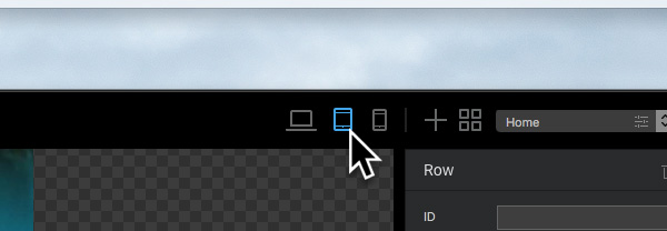
To change how the columns within a row stack on a tablet, first navigate to the top right side of the apps main toolbar and select the tablet breakpoint by Left Clicking on the associated symbol.
Now the design canvas is switched to the tablet breakpoint view, select the row you wish to edit by Left Clicking it on the design canvas and then navigate to the sidebar options. Under the Appearance section you will see a segmented control labelled Width. This control has two options, the first option makes the columns stack horizontally and the second makes them stack vertically.
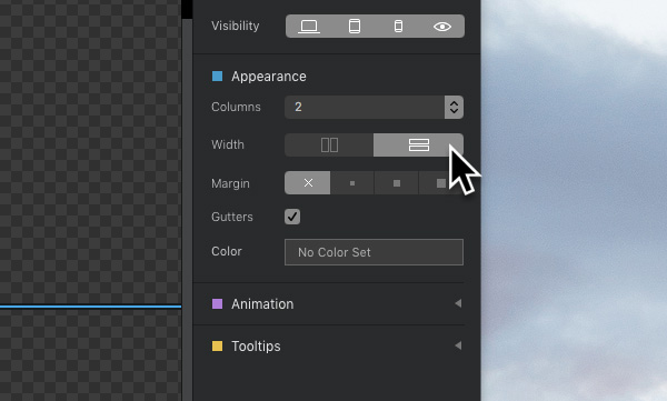
Left Clicking either of these options will apply the changes to the columns within the selected row. Now when you preview your site on a tablet you should see the column stacking direction change.