Most mobile phones and a lot of modern computers now have high resolution (Retina) screens, this means they have a higher pixel density. If you want to make the images from your site look really sharp on both standard and high resolution screens, you will need to provide addition versions of your image files with different pixel densities.
Resolution Requirements
Multiple resolution files are usually required in three sizes:
@1x – Standard Resolution 1:1 pixels
@2x – Double Resolution 2:1 pixels
@3x – Triple Resolution 3:1 pixels
If you are not from a design background, this may sound a little confusing. Basically an @2x image is twice the size in pixels as an @1x image and an @3x image is three times the size of an @1x image, e.g.
@1x – 50x50px normal size
@2x – 100x100px 2x the size of @1x
@3x – 150x150px 3x the size of @1x
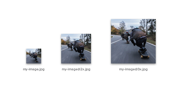
When creating multi resolution images, it’s common to apply a text suffix in the file name for the higher resolutions, so they can be easily identified e.g.
• my-image.jpg
• my-image@2x.jpg
• my-image@3x.jpg
Applying Multiple Resolutions
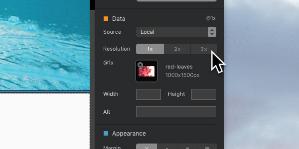
Once you have your images created in the 3 required sizes, Blocs makes it very simple to add them to a project in order to deploy the correct size based on the users screen density.
To add multiple resolutions for an image Bric, simply select the Image on the design canvas by Left Clicking it and then navigate to the sidebar options. Under the section labelled Data, there is a 3 way segmented control with each option labelled @1x, @2x and @3x. Left Clicking any of the 3 options will set the image options for that target resolution. Now if you Left Click the image thumbnail located directly below the segmented control, you will be asked to select the specific image file to be shown in that resolution.
You can now apply additional images for both @2x and @3x, these additional images will be served to a visitor if they have a device with a higher pixel density.