Websites built with Blocs use the Bootstrap framework, when a site that uses Bootstrap is viewed on a mobile device, the standard navigation links become a toggle menu that is accessed via a button, this is normal behaviour as it improves the mobile user experience.

Changing the Toggle Breakpoint
There are times when you may wish to display the toggle menu for Tablet and Desktop breakpoints as well as Mobile, Blocs makes this incredibly easy to do. First select the navigation Bric by Left Clicking it.
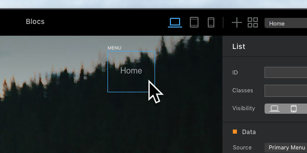
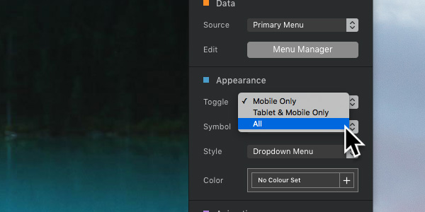
Now navigate to the drop down button labelled Toggle, by default this option is set to Mobile only, if you want the toggle menu on Mobile and Table set it to Mobile and Tablet only and if you want it on Mobile, Tablet and Desktop set it to All.
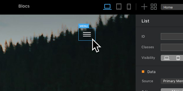
Depending on which view mode, you have Blocs set in, you should now see the navigation switch to a toggle button.
It’s also possible to set the appearance of the toggle menu symbol and menu style.