A Breakpoint is a term used in responsive web design. When viewing your website on various devices it is important the content is set out correctly to provide the best possible viewing experience for your visitors. Breakpoints ensure a websites content will respond to the size of the screen from which it is viewed.
While you build your site and also when you use the in app preview, Blocs gives you the ability to view your project at three different breakpoints, desktop, tablet and mobile. This functionality combined with the visibility options and custom classes allows you to create a completely unique experience for your users depending on the device they are using when they visit your website.
Changing The Current Breakpoint
To view your project at a different breakpoint, simply navigate to the top right side of the apps main toolbar and select one of the three available breakpoint options by Left Clicking on the associated symbol.
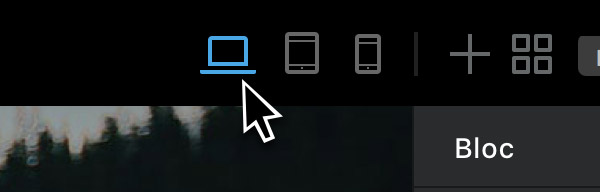
Doing this while in preview mode simulates your site being viewed on a tablet or mobile phone screen to help give you a better idea of how it will look when being viewed on the device.